Re-imagining the BrainDo Logo
Scott Hinners | SEO Strategy
Recently, we at BrainDo made the decision to take a good look at how our brand was evolving over the past year and figure out how to present that in our brand identity. At the core of that identity is our logo. It would live on our business cards, our social media profiles, our stationary, our website and the placard on the halls of our current co-working space.
The logo is more iconic, has more personality, uses updated colors – in effect it’s more of a mark, it’s more memorable.

With the team growing and evolving, it was important for us to solidify a logo that would speak to our brand identity and reflect the growing team. We also saw a need to exist in a space alongside other great Philadelphia agency brands and logos.
The original logo, like many early iterations of logos, was more of a formality than a brand exercise. It lacked meaning. We all agreed that it didn’t convey what BrainDo was about or the type of team we set out to be.
Before diving head first into the ideation phase, we nailed down certain guidelines for the logo. Brian Schwartz, who heads up our creative at BrainDo lead the charge to bring the BrainDo logo into the next stage of its life. “We wanted the logo to do a few important things,” he explained, “It needed to be a stand-alone icon – identifiable and iconic enough without the BrainDo name. It also needed to be strong and graphical, yet feel approachable.”
“We modernized the look and feel, and avoided being “too trendy”” said Brian. “Something that could hold its ground for years to come. We don’t just want something perfect for now. This works whether we are 5 or 150 people agency. It still works, it’s got staying power.”

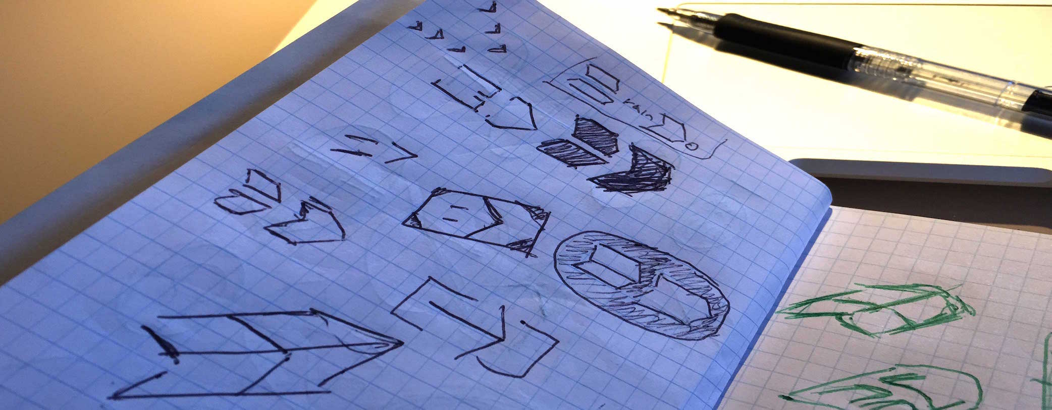
Logo design involved tons of sketched. Get all the ideas out on paper and exhaust the different directions. This part of the process is possibly the most important and fun part of the process. It was a game of balancing internal needs and finding a design that was fun. By the end of the process, there were 40+ sketches, from very literal iterations involving a “brain” to interpretive symbols and shapes.

During the sketch phase, we ended up came across the final logo idea early, but went much further trying out different designs etc.
The designs went from 40 sketches to 20 eventually to 2 final designs to decide between. In order to get a good feel for each of these logos, we did the full corporate identity exercises: business cards, web pages, black and white, stationary, presentation, it even went as far as photo shopping it into the walls of the BrainDo office.

In the end, the arrow design won out over the rounded letters. The shape kept coming back during the design process. It was a nice, fixed logo that played with shape and lines and worked well with the right typeface. It’s modern, energetic and subtly suggests the notion of moving forward. It feels like a logo that can stand the test of time, and that’s what we’re counting on.