
If our site testing work has taught us anything, it’s that little improvements on a website can make a big difference. Colors, headlines and images are obvious, but it’s often the small elements of a page that can provide measurable value. The ecommerce quantity box is just one of these elements that is often taken for granted.
When designing and developing an ecommerce checkout process most CMS’s have a quantity selector built-in. If you’ve put a lot time and research into your design and UX, you should not underestimate the value of designing a great, functional quantity selector that works specifically for your checkout process.
Any snag along your checkout process could result in lower conversions on your site. The quantity box is most commonly found on ecommerce websites and allows for a quick, simple ad clear way of choosing the amount of an item you wish to purchase.
One common improvement that can be made to a quantity selector is to utilize a dropdown instead of a text box. This makes the task accomplished by only clicking and removes the extra step of typing. This is a small tweak that helps users through checking out. This especially holds true for mobile users who are more likely to use touch controls rather than typing, but shouldn’t be neglected in desktop design.
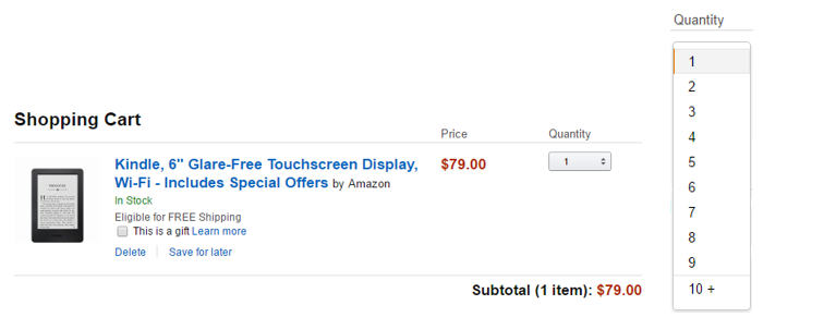
Amazon uses the drop down quantity selector on their shopping cart pages. It doesn’t go on infinitely but stops at 10+. If a user selects the 10+ option it gives them the text box to type in the exact amount.
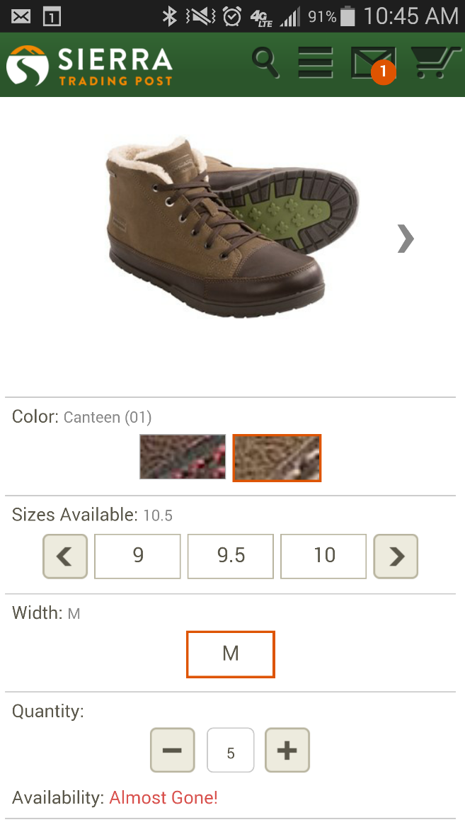
Sierra Trading Post changes things up on mobile and gives users the choice to use plus or minus icons to change quantity while leaving a text box to type quantity. The icons are easy to use and universal to understand. The button sizes are also extremely easy to press on mobile.
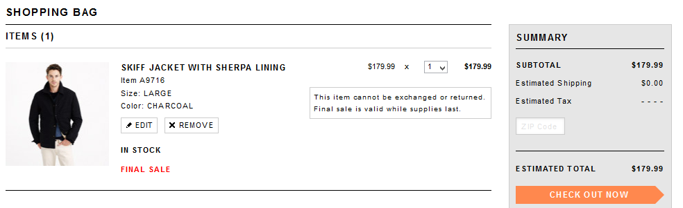
J.Crew provides both the quantity selector and the ability to edit the item which brings users back to the product page.
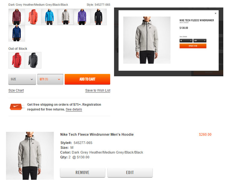
Nike allows users to change the size as well as quantity under the edit option. They cut out sending users back to the product page by using a pop-up when editing. I like this flexibility but it would be interesting from them to combine the views and have it update real time if it’s not a constraint on their ecommerce platform.
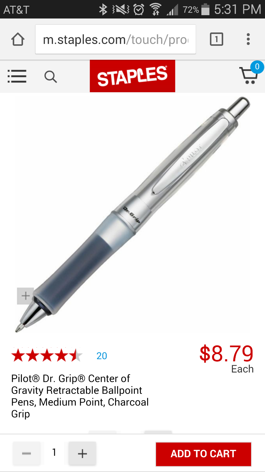
Staples mobile allows users to select the quantity and add to cart from anywhere on their product page. Like Sierra Trading Post they use the plus and minus signs while allowing users to manually type quantity. The bottom bar persists as you scroll through the details or images of the product. It’s a clever feature that keeps their call to action on the page at all times.
Incremental lifts in the checkout process will add up. Reconsidering the design and user experience of your site’s own quantity box can improve your checkout process and make it painless for users. If your average number of distinct items per purchase is less than 10, this should be a no brainer. Applying the overall concept of minimizing steps to purchase across the entire site will pave the road to a great checkout and results.